Good value-driven design is multifaceted. It’s creative and innovative, yet functional and provides people with the best user experience. Getting the balance right can be incredibly difficult, but the golden ratio is a design principle that makes creating visual content for a website a lot easier. It works for any image and can be used to create beautiful visual content for your website.
What is the golden ratio?
The golden ratio is most simply described mathematically as 1:1.618. In design, you build a golden ratio section that respects this principle. Essentially, you divide your image into sections that reflect the ratio. There is a mathematical formula you can follow to achieve this ratio that uses the Fibonacci sequence.
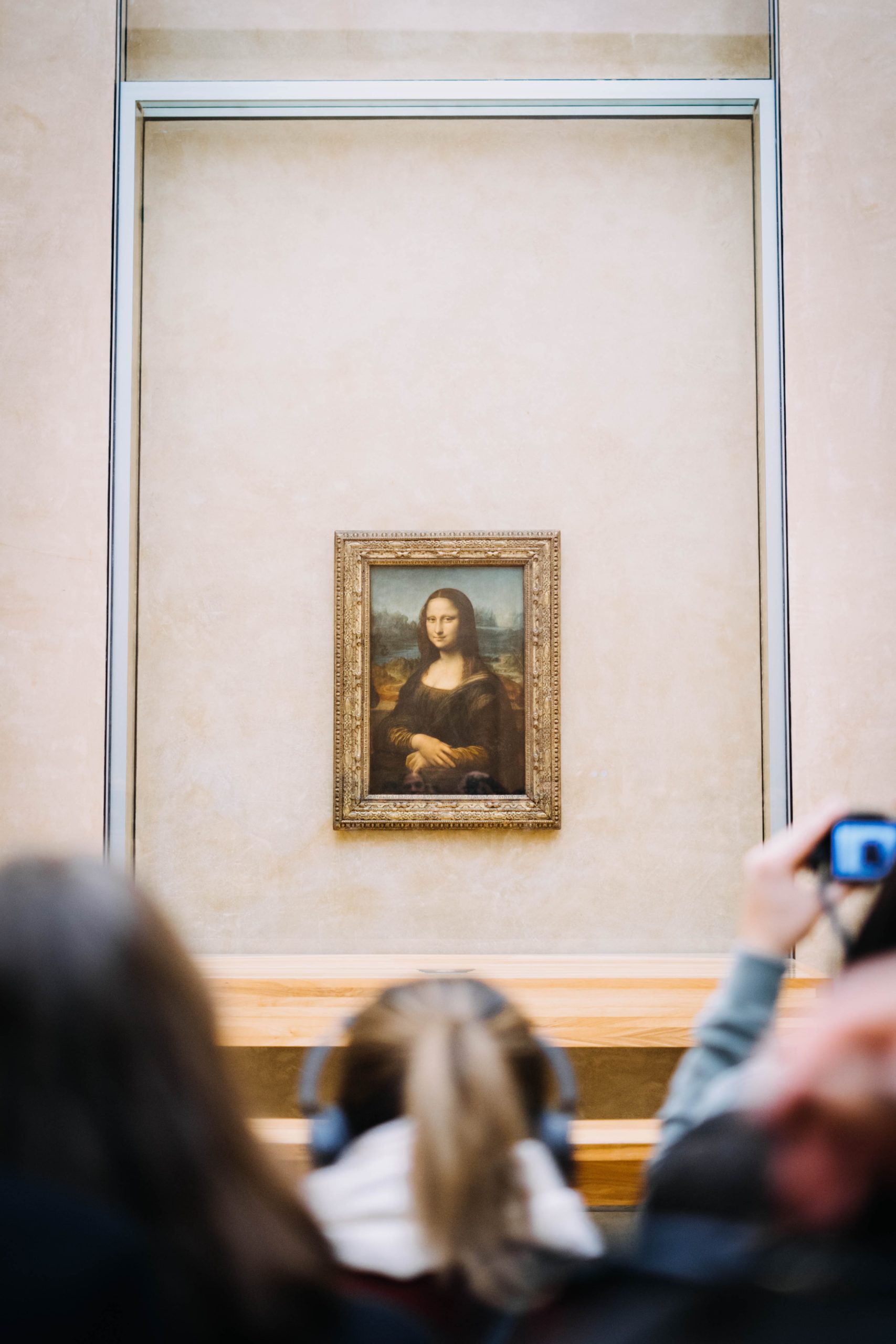
It’s been used by famous designers and artists throughout history, such as Da Vinci, the architects of the Egyptian pyramids and even the logo designers for Apple, Pepsi and other major brands.
Why do designers love it?
The golden ratio creates structure and is aesthetically pleasing, no matter what type of design it’s used for. Your brain is hard wired to think that anything visual which uses the golden ratio looks good. Designers employ this technique hoping to evoke an emotional response. Even tiny details that bring your design closer to the golden ratio will make it more beautiful to the eye and have a positive impact on how much your customers love your website!
A strong visual appeal is a key reason why customers keep returning to your site. You can use the golden ratio in your brand attributes to build a beautiful website. A central brand goal for any company is being memorable to your customers. People are much more likely to remember design elements that are aesthetically pleasing. Using the golden ratio will help your customers remember you over your competitors.
How you can use the golden ratio in your work
You can use the golden ratio in any form of visual art, including graphics, logos, images and even web design. For instance, the front page of your website could use it to immediately draw in customers and have a positive impact on the way they view your brand.
Here are a few tips on how to do this:
- Use the golden ratio to create the perfect layout and avoid clutter on your home page.
- Leave enough space between different elements on your image, graphic or web page.
- Arrange your content using the golden ratio for a striking effect that sets you apart from your competitors.
- Create a balanced composition where the elements are in perfect harmony.
- Build your logo using the golden ratio for a pleasing, perfect structure.
The golden ratio is an important element of appealing design that can improve visitor engagement on your website and encourage return visits. By bringing your site layout closer to this all-important ratio, or by incorporating it into your new logo, your customers will have a positive experience from your visual design and will be more likely to come back for more.
Find more design tips in our blog on design details you can’t overlook.


