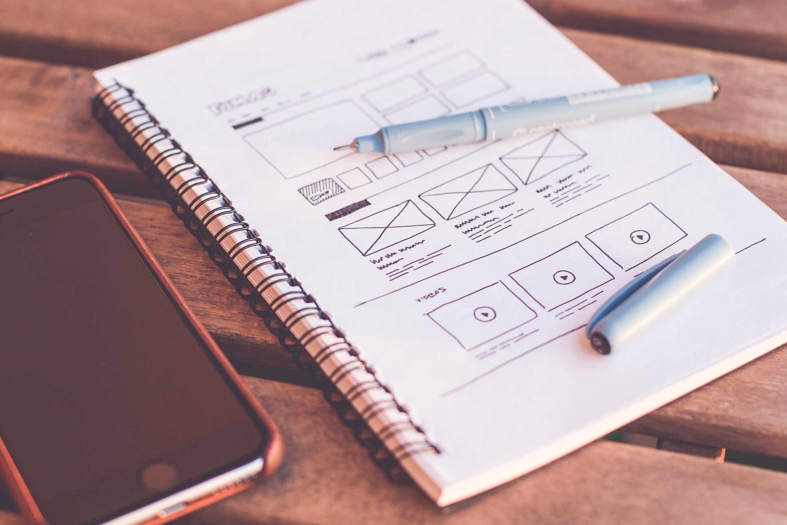
With over 1.5 billion websites currently live, it’s increasingly important to stand out. Value-driven design helps you to do just that, by focusing the web design process on adding value for your target audience. If your website stands out, you will get the clicks rather than your competitors.
Here are our top five design details that you can’t afford to overlook. They’ll add value to your design and convey your brand messaging to your target audience.
1. About us
Your ‘About us’ page personalises your website, breathing life into an otherwise faceless organisation. Your target audience wants to know who they’re considering buying from and are more likely to hit that purchase button if you show some personality. ‘About us’ is also a great place to include key brand messaging for your audience.
2. Familiar navigation
When people first land on a website, they tend to use your menu to explore what you have to offer. They don’t want to do too much work to find the information they’re looking for. If it isn’t obvious where the menu is and the layout isn’t familiar, your target audience will be turned off and quickly leave your website. A site structure that is intuitive and familiar to users is a design feature that can’t be overlooked.
3. Contact page
‘People buy from people’, as the popular saying goes. While it may be difficult to get your target audience to trust your website, they’re more likely to trust the person behind the brand. Your contact page is a crucial feature – you can show that the website isn’t run by robots and get across your brand messaging.
It’s also a great place to provide customers with the next step, which, if you’re a service business, is contacting you. If you provide products online, your contact page is a great place for customers to find out how to get more information.
4. Use your footer as a roadmap
Value-driven design is about creating a website structure that adds value for your customer. The footer is a great place to do this. Once your target audience has got to the end of a page, they want to know where to go next. A well-designed footer acts as a roadmap to the rest of your website and pushes your customer further down the sales funnel.
5. Consistency
Having consistent brand messaging, design features, imagery and even a consistent tone on your website is crucial to attracting your target audience. Your website should feel like you and be on-brand for your company. This makes it crucial to have consistent design features throughout.
Not sure where to start to make your website stand out from the crowd?
Contact us to see how we can create a value-driven design for your website that strongly appeals to your target audience, improves visitor engagement and drives more sales.


