Close
Collaborating with Barnardo’s, we gathered insights from children, young people, and community organisations to ensure co-creation was central to our brand development process. We repeatedly heard that to encourage trust, Barnardo’s needed to communicate and demonstrate a fresh approach to supporting children and young people of African, Asian and Caribbean heritage that is both celebratory and empowering.
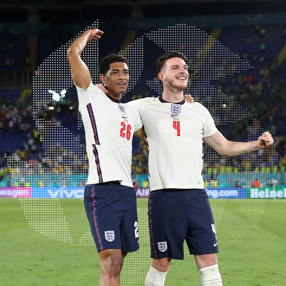
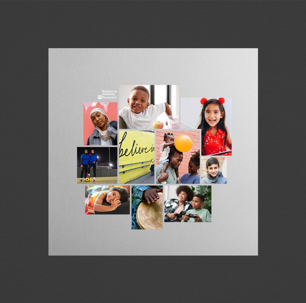
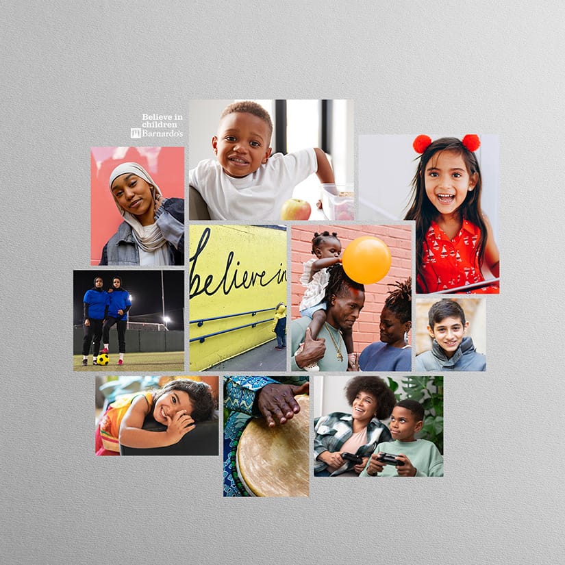
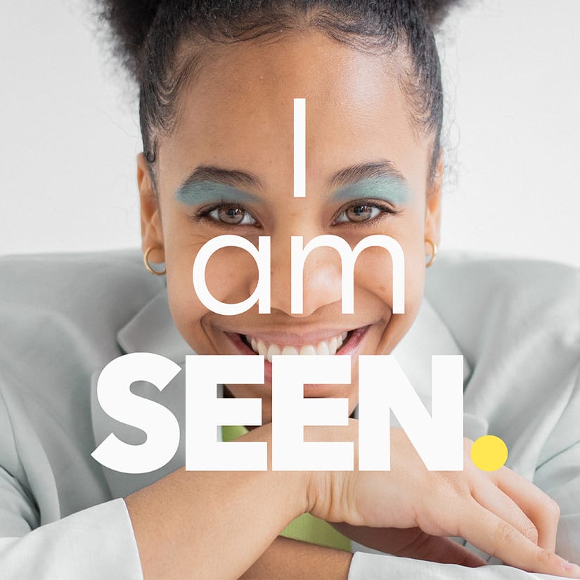
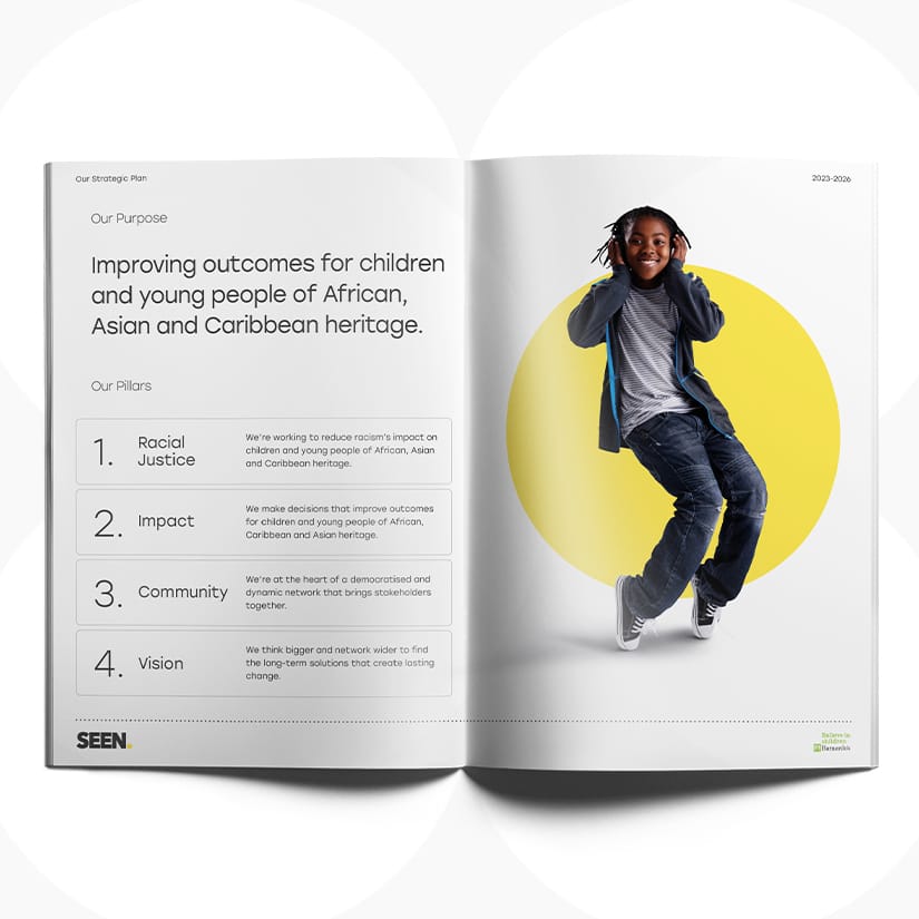
We created a clean, stylish, imagery-led visual identity that combined authentic photography of African, Asian and Caribbean children and young people in the UK. Central to the visual identity are clean lines, bold text and vibrant pops of colour inspired by the ‘spotlight’ concept – shining a light on the children and young people in their joy and power. We also coined an iconic brand name, Seen, to demonstrate to the organisation’s stakeholders that the fullness of their identities, experiences and challenges were acknowledged and understood.
Paired with clear messaging and a three-year strategic approach focused on multiple stakeholder engagement, the brand was exceptionally well received. We also took the Seen team through an extensive UI/UX process to create an accessible website focused on an efficient user experience. As a result, the entire Seen concept was easily understood, and the children and young people immediately felt empowered by the joyous imagery used across the brand.
The Client’s Challenge
In 2020, Barnardo’s recognised a need to launch a specialist centre focused on improving outcomes for children and young people of African, Asian and Caribbean heritage. However, to effectively combat the specific challenges these communities face, and address their wariness of charity involvement, the organisation needed to think differently about how the centre operated. Previously, charities with similar goals had alienated the communities they attempted to help by centring themselves within the solutions and failing to acknowledge, celebrate and connect with the young people and the reality of their lives.
Working with Barnardo’s on their bold and ambitious plan to better address the needs of the communities they were aiming to support more effectively, we developed an ambitious charity brand strategy and identity to deliver on their aspirations. The brand needed to communicate a fresh perspective, the extensive insight of the team and the solid connections they have with children and young people of African, Asian and Caribbean heritage and the wider communities they are part of.
Our Approach
Working with the Barnardo's team dedicated to the centre's development, we undertook our signature Immersion process to establish the charity brand values, personality and direction. We also identified specific areas of work, challenges and goals to build an initial picture of how the new brand could take shape.
To underpin our work on the visual and strategic concepts, we attended a vision day with one of the brand's key stakeholder groups and unearthed further frustrations about the way charities traditionally supported African, Asian and Caribbean communities. Here, we participated in a storytelling activity that explored how power structures work in the charity space using an allegorical tale of a lion, hyena and vulture.
It became clear that this new brand would need to work even harder to win the trust of its stakeholders, and that a new, inclusive approach was needed for the new initiative to succeed. It was also apparent that the charity brand messaging needed immense clarity to avoid confusion about how the centre would work and an impactful name that would set it apart.
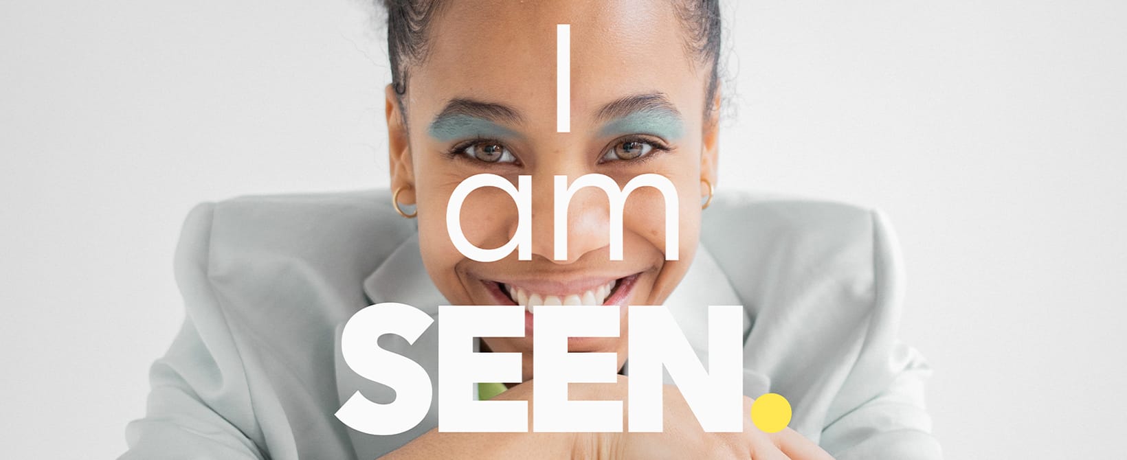
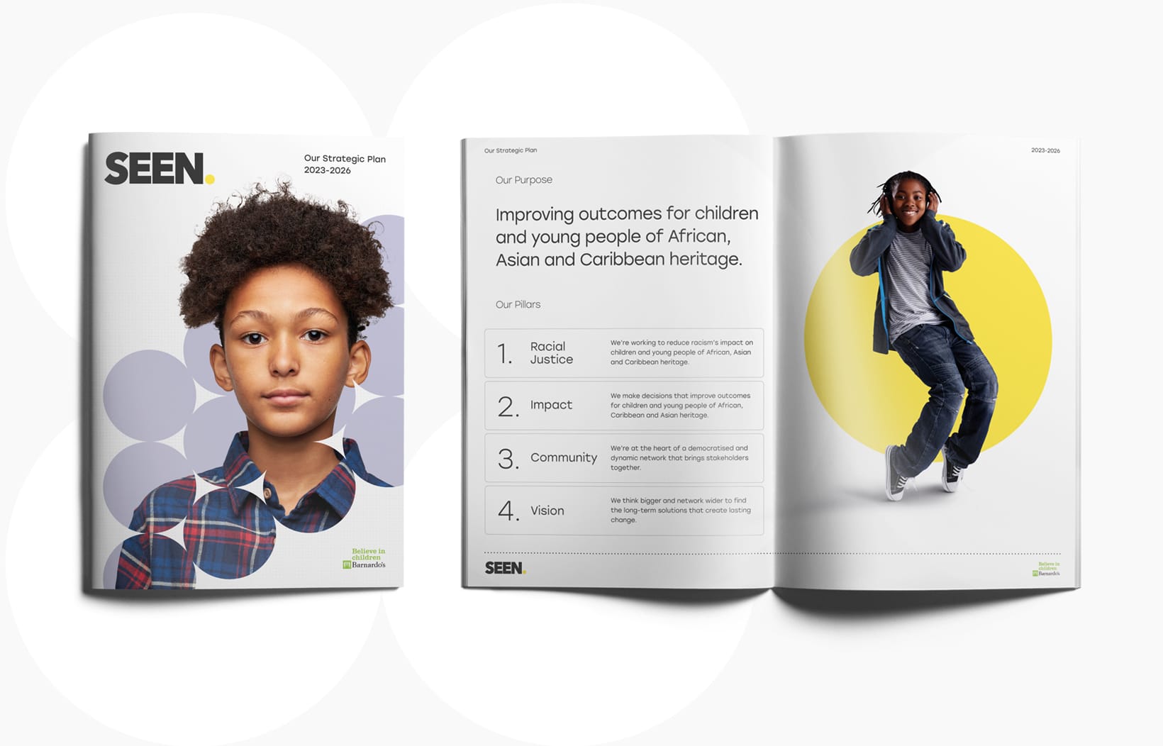
In developing a comprehensive brand strategy, we focused on building a reputation of trust, insight and a genuine desire to uplift children and young people of African, Asian and Caribbean heritage. This included a three-year engagement plan, a thorough approach to brand positioning and the development of a powerful name – Seen – that communicated the brand pillars of racial justice, community, impact and vision.
Inspired by a quote from rapper and activist Akala, the name Seen was chosen for its extensive connotations that would speak to the wide range of stakeholders the brand would need to engage. Essentially to be seen is to be understood, and the name tells the children and young people that the brand understands the richness of their culture, the breadth of their experiences and how their identity impacts their lives. Simultaneously, the name tells all other stakeholders that the organisation understands their frustrations and invites them to collaborate on a path forward together.
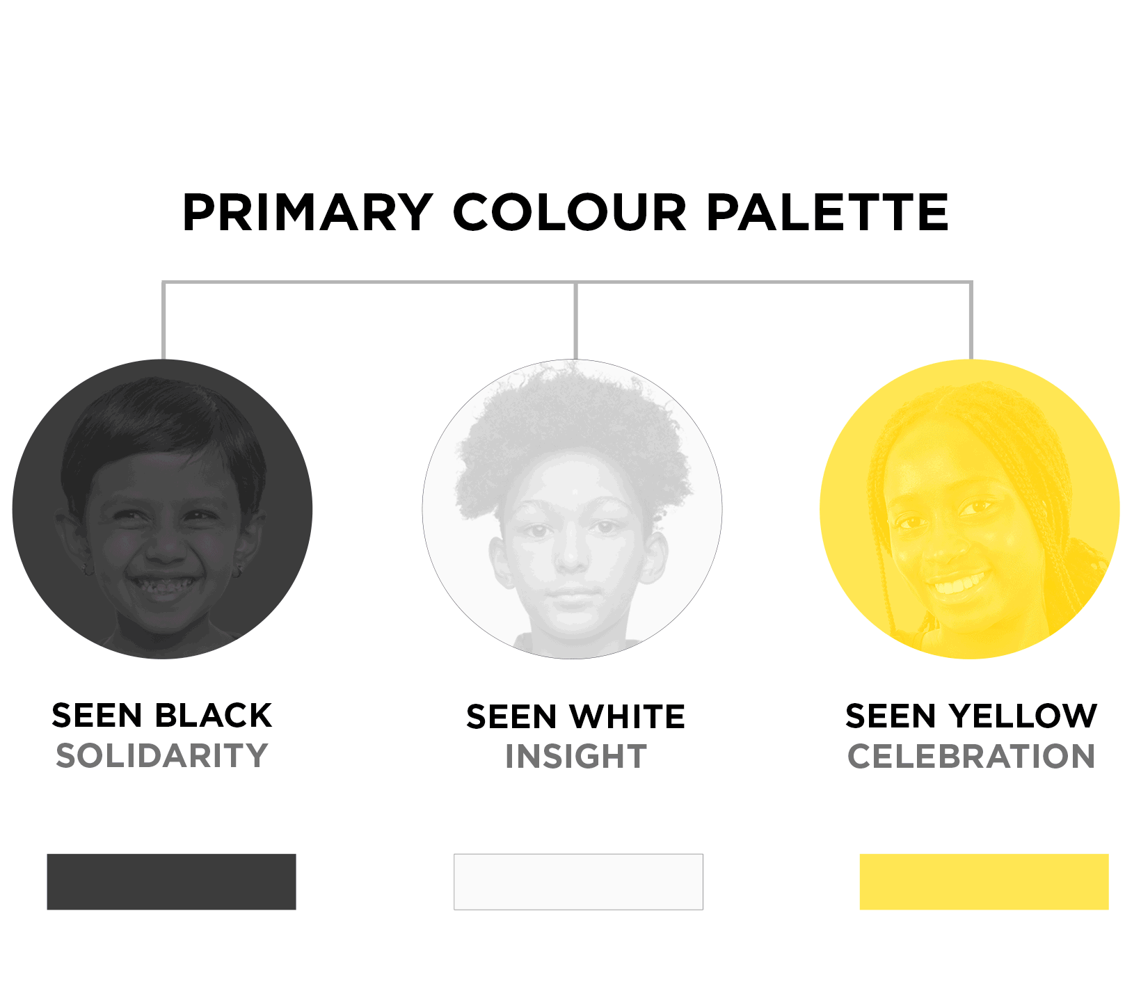
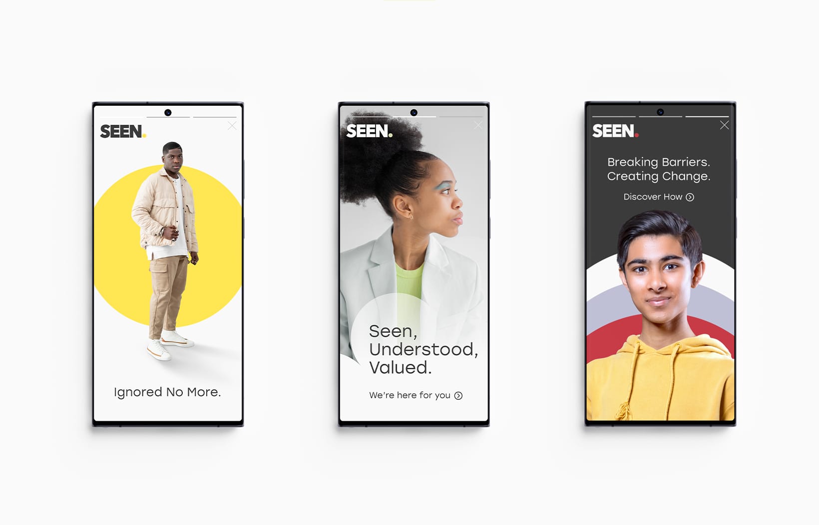
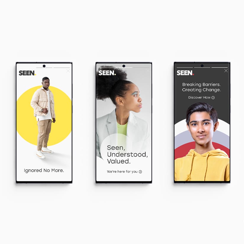
As the name was so conceptual, we kept the brand messaging and tagline simple and descriptive to help anchor the brand. Our creative team echoed this philosophy with their design, creating an imagery-heavy visual language of clean lines and bold shapes that centre children and young people at the heart of the brand. The visual identity prioritises clarity and incorporates eye-catching pops of bold colour in a nod to the evocative, vibrant hues taken from the clothing worn by the children and young people featured in our brand photography – thus making them the essence of Seen's brand world. The pops of colour also gave the brand versatility, so it could be pared back for official documents and reports and dialled up to create super compelling campaigns.
Instead of relying on cliched saviour tropes, the brand features imagery that celebrates the full identities of children with African, Asian and Caribbean heritage living in the UK instead of focusing on their struggle alone. The slick combination of bold type and compelling imagery also created a sophisticated, almost editorial brand identity that reassured influential decision-makers that although Seen is pioneering a new approach, it's a charity brand to be taken seriously. This created an unexpected and inspirational feel that made Seen stand out amongst the dozens of faceless peers within the space.
Finally, we worked with the Seen team extensively to define their audience so we could create considered audience personas that highlighted key needs and frustrations, which informed a thorough UI/UX process. As a result, the new website design prioritised accessibility, efficiency and the time-poor reality of Seen's audience.
The Outcome
The new charity brand resonated deeply with the Seen team and garnered great feedback from the children and young people themselves. They immediately felt represented in the imagery used across the brand and the short, sharp brand name, and felt the brand concept was easy to understand. In addition, its distinctive feel communicated Seen's unique insight into the issues they want to address and the innovative strategy to help them create the change they want.
“Because we work within the social justice space, we needed an agency serious about equity and tackling injustice, with a particular specialism in building anti-racist brands. Jérrard Wayne's proven experience and the quality of their brand work made them the perfect fit for this project.The whole process was top tier. We couldn’t have asked for a better team to collaborate with, who have supported us as we have grown in our confidence in communicating our values, and steering away from the usual charity image.”
“Because we work within the social justice space, we needed an agency serious about equity and tackling injustice, with a particular specialism in building anti-racist brands. Jérrard Wayne's proven experience and the quality of their brand work made them the perfect fit for this project.The whole process was top tier. We couldn’t have asked for a better team to collaborate with, who have supported us as we have grown in our confidence in communicating our values, and steering away from the usual charity image.”
Collaborating with Barnardo’s, we gathered insights from children, young people, and community organisations to ensure co-creation was central to our brand development process. We repeatedly heard that to encourage trust, Barnardo’s needed to communicate and demonstrate a fresh approach to supporting children and young people of African, Asian and Caribbean heritage that is both celebratory and empowering.
We created a clean, stylish, imagery-led visual identity that combined authentic photography of African, Asian and Caribbean children and young people in the UK. Central to the visual identity are clean lines, bold text and vibrant pops of colour inspired by the ‘spotlight’ concept – shining a light on the children and young people in their joy and power. We also coined an iconic brand name, Seen, to demonstrate to the organisation’s stakeholders that the fullness of their identities, experiences and challenges were acknowledged and understood.
Paired with clear messaging and a three-year strategic approach focused on multiple stakeholder engagement, the brand was exceptionally well received. We also took the Seen team through an extensive UI/UX process to create an accessible website focused on an efficient user experience. As a result, the entire Seen concept was easily understood, and the children and young people immediately felt empowered by the joyous imagery used across the brand.
Want to better align your purpose with perception? We’d love to help.